
Cause & Effect, On a Timeline
See Why Every Objective Matters. — and When It Lands.
The same scorecard data, told two ways a Strategy Map that traces cause-and-effect between objectives, and a Strategy Roadmap that puts every initiative on a live Gantt timeline
Trusted by 100+ Organizations for KPI, HR, and Performance Management
DoerHRM supports organizations with KPI software, HR solutions, performance management, KPI training, coaching, and practical business improvement programs.











The Same Four Perspectives, In Order
Four perspectives. One direction of cause and effect.
The Strategy Map flows bottom-up through the same four Balanced Scorecard perspectives — each one feeding the next, until it lands on the boardroom’s bottom line.
Learning & Growth
The starting point. Workforce capability and digital adoption objectives live here — everything else in the chain depends on this foundation.
Internal Process
Feeds from Learning & Growth. Operational and safety-execution objectives that turn capability into reliable delivery.
Customer
Feeds from Internal Process. Delivery-quality and satisfaction objectives that determine whether execution actually lands with the market.
Financial
Where the chain ends. Margin and revenue objectives that every objective below ultimately exists to protect.
Strategy Map
Trace cause and effect
on one page.
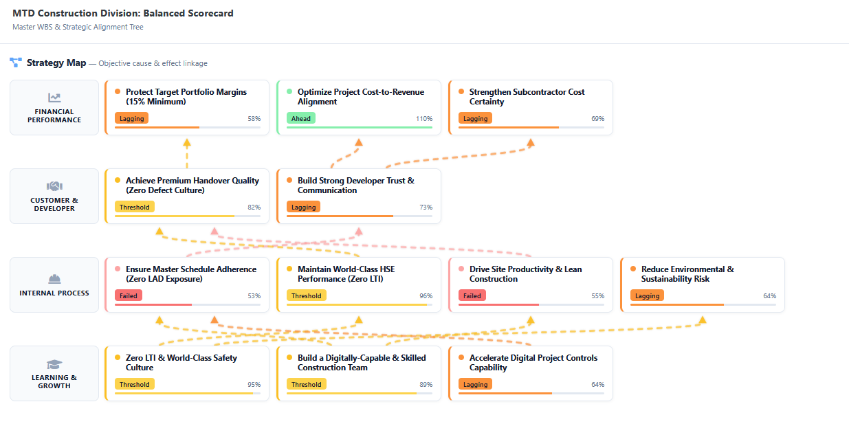
The Strategy Map lays out your scorecard objectives as a classic cause-and-effect diagram, flowing bottom-up through four perspectives: Learning & Growth → Internal Process → Customer → Financial Performance. Dashed arrows show exactly which lower-level objective drives which higher-level outcome.
Every objective node carries a live status badge, so the map is a living diagnosis, not a static poster. When a financial objective is lagging, leadership traces the arrows backwards to find the operational root cause.
Ahead
Threshold
Lagging
Failed
Causal flow: Learning & Growth → Internal Process → Customer → Financial
Strategy roadMap
Every initiative,
on one timeline.
The Strategy Roadmap converts every strategic initiative into a Gantt chart, grouped by theme and sub-theme. Each bar shows the initiative’s duration across the year, its live progress percentage, and a “Today” line marking exactly where the organisation stands.
Leaders instantly see what’s running, what’s complete, and what’s at risk of slipping — no separate project-tracking spreadsheet required.
One Status Language, Every Objective
Four live states — not just red or green.
Every objective on the Strategy Map carries one of four live health states, so leadership gets a real diagnosis instead of a binary flag.
96%
Ahead
Performance exceeds target — no action needed, just keep going.
82%
Threshold
On the acceptable line — worth a watch, not yet a concern.
58%
Lagging
Below target and needs attention before it slips further.
<40%
Failed
Has missed its target outright — the objective the arrows get traced back from.
The Map Answers Why
Trace a lagging financial objective back through the causal chain to the real operational root cause — a documented path, not a guess in a strategy review.
The Roadmap Answers When
See exactly which initiatives are on schedule, already complete, or at risk of slipping — before anyone has to ask in a status meeting.
Together they stop the two most common strategy failures: initiatives that don’t connect to any objective, and objectives that have no initiative behind them.
Everything You Need
Two views, no re-entry, one source of truth.
Visual Cause & Effect
Build clear causal paths between financial and operational objectives a lead-and-lag relationship visualiser, not a static slide.
Theme-Grouped Gantt
Every initiative grouped by theme and sub-theme on one timeline, with a live “Today” marker against plan.
Same Data, No Re-entry
Map and Roadmap read from the same live scorecard data as the BSC tree and CEO Dashboard update once, everywhere stays current.
Four-State Live Status
Ahead, Threshold, Lagging or Failed on every objective node an instant diagnosis, not just a percentage.
Root-Cause Traceback
Trace a lagging financial objective backwards through the causal arrows to the operational objective behind it.
Live Progress Per Initiative
Every Gantt bar shows a real progress percentage updated as work is logged, not typed into a slide once a quarter.
Frequently Asked Questions
Frequently Asked Questions about Strategy Map & Roadmap
A Strategy Map is a cause-and-effect diagram that shows how objectives in one perspective drive outcomes in another — flowing bottom-up through Learning & Growth, Internal Process, Customer, and Financial Performance. Dashed arrows connect each lower-level objective to the higher-level outcome it supports.
The Strategy Roadmap converts every strategic initiative into a Gantt chart, grouped by theme and sub-theme, with a live progress percentage and a Today marker showing exactly where the organisation stands against plan.
These are the four live health states DoerHRM assigns to each objective on the Strategy Map: Ahead means performance exceeds target, Threshold means it’s on the acceptable line, Lagging means it’s below target and needs attention, and Failed means it has missed its target outright.
The Balanced Scorecard tree lists every Perspective, Objective, KRA, KPI and Initiative in a structured hierarchy. The Strategy Map takes the same objectives and draws the causal arrows between them, so you can trace a lagging financial objective back to the operational root cause.
Yes. DoerHRM is free for up to 3 users and includes a 14-day full-feature trial with no credit card required.
Stop presenting strategy.
Start tracing it.
Get a live walkthrough of the Strategy Map and Strategy Roadmap on your own objectives and initiatives.